Viewport
The Viewport Panel
The Viewport, in the center of the HoloEdit UI, displays your current Composition in 3D, and provides interactive tools for arranging your Composition. Upon launching a new Composition, the viewport is blank. When the Composition includes one or more Tracks with Mesh data for the selected frame, the Viewport will display all visible geometry.
The Viewport Panel has three major pieces:
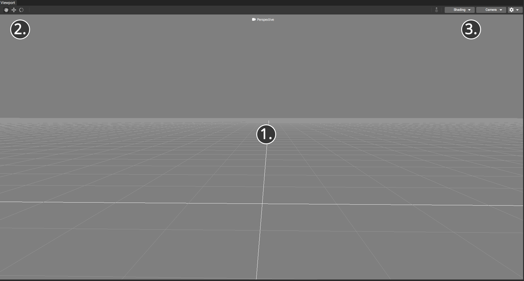
The 3D Viewport, where you see the ground plane grid and your Composition
The Toolbar, on the top left
The Display Options toolbar, on the top right
3D Viewport
The 3D viewport displays your current Composition in 3D for review and some interactive edits, such as translation and rotation.
The Camera Projection Display, at the top center of the viewport, displays whether the current view is Perspective (3D) or Orthographic (2D)
The 3D viewport represents 3 axes, used for camera navigation and object transformation, X, Y, and Z.
Y faces up, Z faces towards the starting camera position, and X faces to the camera right.
The 3D Viewport displays the Viewport Grid (a grid containing 1x1 unit cells on the X and Z plane,) plus 3D samples contained in your Composition and additional UI elements called “Gizmos”, representing non-visual mesh data, like “bones”, and interactive 3D tools (such as the Transform gizmos).
Interactive gizmos, such as the translate and rotate tools can be interacted with by left clicking and dragging on the gizmo when it’s visible in the viewport.
The Toolbar
The Viewport has Tool buttons on the top left of the viewport window. These are:
The Hand Tool: Disables other Transform tools
The Move Tool: Displays Move handles at the pivot point of your selected Track
The Rotate Tool: Displays Rotate handles at the pivot point of your selected Track
Display Options
The Toggle Lighting button: Enabling lighting shades your compositions geometry with a single directional light. Disabling lighting displays your model “unlit”, with no surface shading. Normals must be present on your mesh to correctly display lighting.
Additional Viewport Options can be accessed from the Shading, Camera, And Debug (Gear Icon) dropdowns in the top right corner of the Viewport. The available options are:
Shading
Shaded: Display the current Composition’s geometry without textures
Wireframe: Display the current Composition’s geometry in wireframe mode
Textured Unlit: Display the current Composition’s geometry with textures, if corresponding texture data is present, and without lighting
Textured Lit: Display the current Composition’s geometry with textures, if corresponding texture data is present, and with lighting
Wireframe Overlay: Displays wireframe edges in combination with Shaded or Textured view modes
Render Reverse Faces: Toggles between back face and front face culling
Camera
The Camera Options Menu allows you to choose between the Perspective viewport (default), which supports panning, zooming, and rotating the camera, and several orthographic (non-perspective) view modes with fixed rotation. Orthographic viewports can be panned or zoomed, but not rotated.
Additional Settings
Rendering Sources
This toggle will display the current “Rendering Sources” In light grey text at the bottom right of your viewport. This will identify which Stages and streams are currently contributing to the Flattened Composition being drawn in the viewport.
Comparison Mode
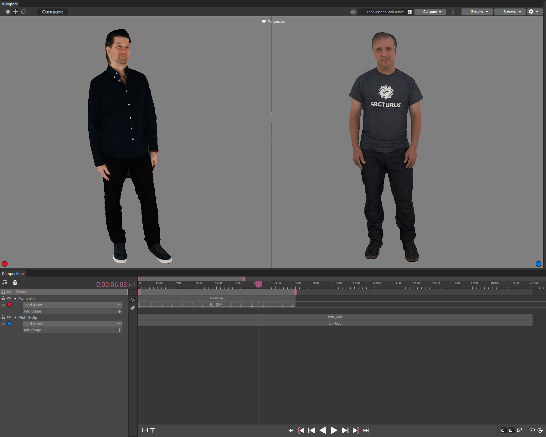
When two Stages with different mesh streams are both selected, a “Compare” option will appear on the top left of the toolbar, next to the transform tool buttons. Pressing the “Compare” button will enter Comparison Mode.
Compare Controls
The Compare Controls are displayed to the left of the Display Options, near the top right of the viewport. The Compare Controls contain the following items:
Comparison Status Bar
A dark bar displaying the names of the two Stages being compared, plus an X button to cancel comparison.
Compare Dropdown
A dropdown menu containing the following comparison modes:
Split View: The Split View comparison mode shows the first (marked with a red dot) and second (marked with a blue dot) selections side by side. In the middle of the screen, there is a bar dividing the two renders, and “Split Handle” which can be clicked and dragged to adjust the display. This mode is useful for visually comparing individual frames
Heatmap: The Heatmap display mode is for reviewing differences between Stages that may not be obvious in a side by side comparison. This is especially helpful when reviewing data that has been compressed by decimation in a clean Stage or by Stages like Stabilize and SSDR
Side by Side: The Side By Side viewmode displays both selected Stages next to each other side by side
Heatmap Details
The heatmap display mode renders the second selected Stage (marked with a blue dot on the Track view)’s mesh, colored with a blue to green to red gradient indicating the degree of difference from the first selected Stage (marked with a red dot on the Track view). In Heatmap view, blue means the surfaces are identical, and red means the difference in surfaces meets or exceeds the Error Max value.
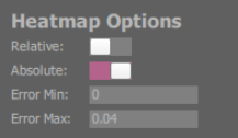
Heatmap view mode has the following additional settings, which appear in a floating window to the top left of the HoloEdit viewport:
Relative: With “Relative” enabled, the heatmap gradient will scale from the smallest to the largest difference on the current frame
Absolute: With “Absolute” enabled, the heatmap gradient will scale from minError to maxError. Values lower than minError will be clamped to blue, and values greater than maxError will be clamped to red
Error Min: The floor value used by Absolute heatmap display
Error Max: The ceiling value used by Absolute heatmap display